I’m Francesco and I help freelancers and small business owners with marketing that works without sleazy tactics or the usual headaches. I'm their guide to unignorable copy, websites you won't drown in, and SEO that doesn't read like a textbook.
This is a new edition of Not Bad, the newsletter that covers lessons from my journey into freelancing, alternative business strategies and “good” trends in design and marketing.
If you haven't already done so, subscribe to Not Bad below.
Once again, today's edition arrives a little late, but here it is—enjoy.
Trying to explain what your product is about feels like trying to draw a house with a calculator. It's brutal. It's pointless. But we live in a society built around doing things other than just 1) baking cakes and 2) brewing coffee, so we're all stuck having to explain what we do. We may as well learn how to be clear, huh?
I'm in the thick of that learning right now. For the third time in less than 12 months, I'm updating my website, nevernotready.club, because I want (I need?) more clarity. I want to make it clearer what I offer, what I don't offer, and what makes working with me worth it.
So when I came across this essay by The Sublime about doing work that defies explanation, followed days later by Igor's "I'm available for work" update, I felt seen. Both were tackling positioning.
Positioning is bigger than I'd like to admit. It's especially clear to me now that I'm doing this redesign work where I'm constantly being reminded (by the HTML and web copy gods) that being able to articulate what you offer and the value you bring clearly and in a few words IS EVERYTHING.
Maybe it’s the reason why these words stirred something in me:
"Being hard to understand doesn't make me special. My thing can feel hard to communicate but if I can't tell you what it is, I'm not protecting its essence—I'm just avoiding the hard work of clarity... THAT'S LITERALLY MY JOB, DAMMIT! To create a clear, easily digestible understanding of what our business is and inject it into the bloodstream of our team first, customers second."
—
, as quoted from this post
I feel called out. As someone who claims to help others communicate better, failing to explain my work is ironic. Something, something, cobbler's children.
By pure serendipity, Igor Schwarzmann came to rescue me from the depths of my mumbo jumbo, and he grabbed my attention not with words but with a BRAT-coded map of his offering:
The first thing I thought of when I looked at this (besides our queen Charlie, of course) was that there's something both forthright and oddly persuasive about seeing someone's skills plotted on two axes. Like, "Oh, so THAT's what you do!"
So I made a map too
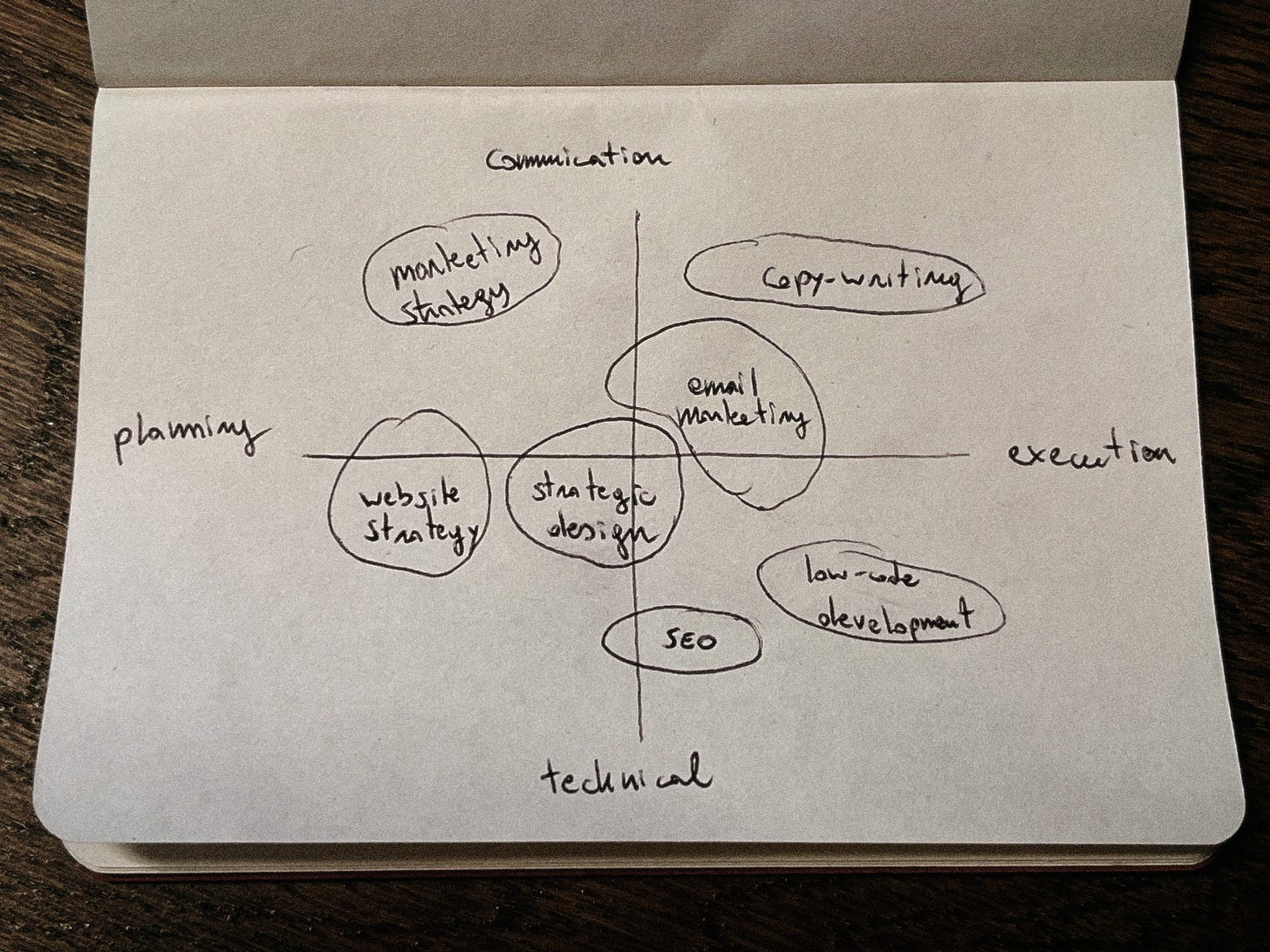
Not to be derivative (okay, totally derivative—sorry, Igor), I too have plotted my business proposition on a graph. Here it is:
Without any context about my business or how my messaging looked so far, looking at this is not particularly eye-opening—I know. But trust me, you only need a quick look at my current website to appreciate how a (deceptively) simple map like this is already so much better at communicating what I can do for people! Plus, creating it was revealing in that fuzzy and unnerving way that means you're probably on to something.
Are you too obsessed with maps now?
Some people call this an offering map (but I'm not 100% sure that's the proper term, so correct me if I'm wrong). It aims to show customers what activities a service provider helps with or what areas a product supports.
Especially as a service business, having a map like this is handy as it gives customers—and employees, if you have any—a better understanding of how to work with you by plotting your strengths.
In fewer words, here is how an offering map can help:
For us business owners: It forces us to confront the professional we think we are (or the product we believe we’re selling) vs. reality. That service you're kinda meh at but keep offering? Why do you keep offering it?
For potential clients/customers: It helps them understand what you can do for them and saves them from wading through a maze of landing pages.
To play devil's advocate, there's this marketing quote that gets passed around like a joint on freshers' week:
"People don't buy products when they understand them. They buy products when they feel understood."
Which, besides sounding profound, reads like a rebuttal to what we just learned about the power of mapping your offering.
Until you think about it for like three seconds: people need both. They need to feel understood AND understand what you're selling them. And maps? They help people understand; they show them what you do while you work hard to make them feel understood.
What will you NOT put on that map?
Borrowing words from Dave Trott, "strategy is not about adding more stuff. It's about taking stuff away. Taking everything away until there's only one thing left. One single powerful thought."
What's not on your map is just as important as what is.
After being made redundant from arguably the best-paid role of my career to date two years ago and then spending the better part of 2024 trying to rebuild said career from scratch, I've learned a few things. One of the biggest lessons is that people can't mentally handle your product or business solving more than 2 or 3 problems.
Clients I’ve come across believe they need a specialist. But the irony is they actually want BOTH a specialist and a generalist—they just don't know it. So they search for a specialist and are then delighted when that person just happens to have other useful skills that (surprise!) end up being crucial for the project.
I don’t mention this to suggest that you hide your multitudes—I, for once, never will. Rather, I encourage you to be selective about what you share and how you frame your work because, in marketing, precision beats comprehensiveness.
Just think, who would ever trust a handmade (1), organic (2) shampoo that claims to repair your hair (3), prevent it from falling out (4), make it less frizzy (5), promote growth (6), make it more voluminous (7), and take your dog for a walk (what number are we at)?
The more promises you make, the less credible each one becomes.
Isn't a list of services enough?
I'd place a list of offerings as the more ambiguous cousin to the graphs above. Lists are where we all start. Here are things I can do for money! 1) This. 2) That.
I've used lists in the past to indicate project fees. In my work for others, I've also used lists in other contexts, such as to name companies a brand has partnered with (think of a "selected clients" list on a website) or to mention people involved in a project.
There's no shame in using lists over graphs in many contexts. After all, a list can often do the job okay; it’ll state what needs to be stated and in the most condensed way possible. But it often lacks the frame of reference that a map/graph provides and can sometimes be misleading without context for its order.
Take a list of artists in an exhibition. Does it name everyone? Yes. Does it give you immediate insight into a shared element of their work and how it relates to other factors? You know the answer.
A map like the one I've been experimenting with can do so much more. It can position each element in relation to others and show connections, gaps and overlaps that a list simply can't convey.
I'm still fighting with my website, but I'll share it once it's done. In the meantime, I'm curious...
How do you explain your work?
And have you tried mapping your offering in some way?
Would love to hear your thoughts.
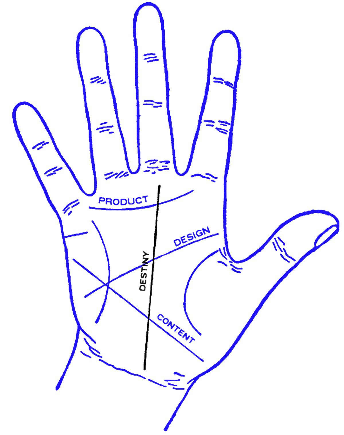
PS: Your map doesn't have to look like mine. Some people illustrate their offering with, for example, a line crossing the creases in a palm, while others use Venn diagrams (very TEDx talk-y). Ultimately, the format matters less than the clarity it brings.


Here at the bottom you will also find the❤️, which you can click if you liked this piece. You can also share it with others who might appreciate it.


